 WEBSITE DESIGN & DEVELOPMENT
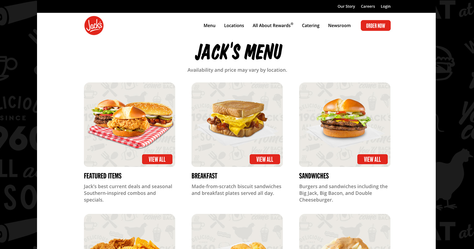
Collective Dallas was tasked with designing and developing the Eat at Jack’s website.
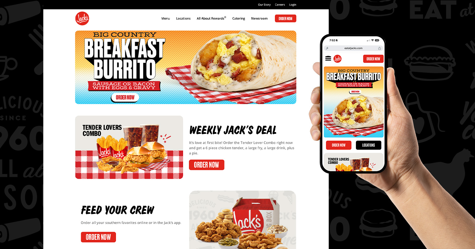
Serving a regional QSR brand with over 280 locations across the South, the experience is built to support both heavy traffic and continuous offer evolution. The concept reimagines the homepage as an app-like mobile experience aligned with current adaptive and action-oriented interface patterns, with ordering, locations, and offers surfaced immediately. Rather than asking users to browse before acting, the design creates multiple clear on-ramps to conversion through repeated “Order Now” CTAs, responsive modular cards, and a structure built to minimize the number of clicks or taps between landing and checkout.
 VISUAL LANGUAGE
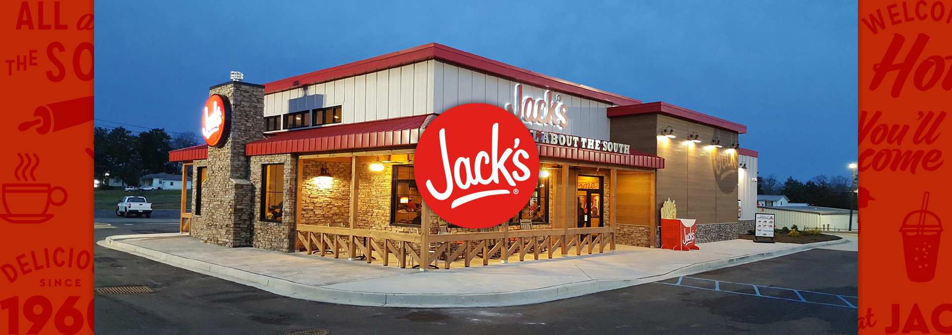
The design system brings Jack’s familiar brand cues into a more contemporary digital expression.
The visual direction references Material Design principles through strong hierarchy, crisp tap targets, legible typography, and color blocking that clarifies action and content grouping. A cinematic hero with full bleed imagery, bold type, and high contrast helps the site feel more modern and less retro, while still retaining the familiar logos, comfort food cues, and nostalgic Southern character that define the brand. Its modular structure allows featured offers, seasonal messages, and promotional content to be updated easily without disrupting the core conversion flow, and can be positioned as supporting a digital platform that receives over 22 million views a month when used in analytics led case study storytelling.
 MOBILE FIRST COMMERCE
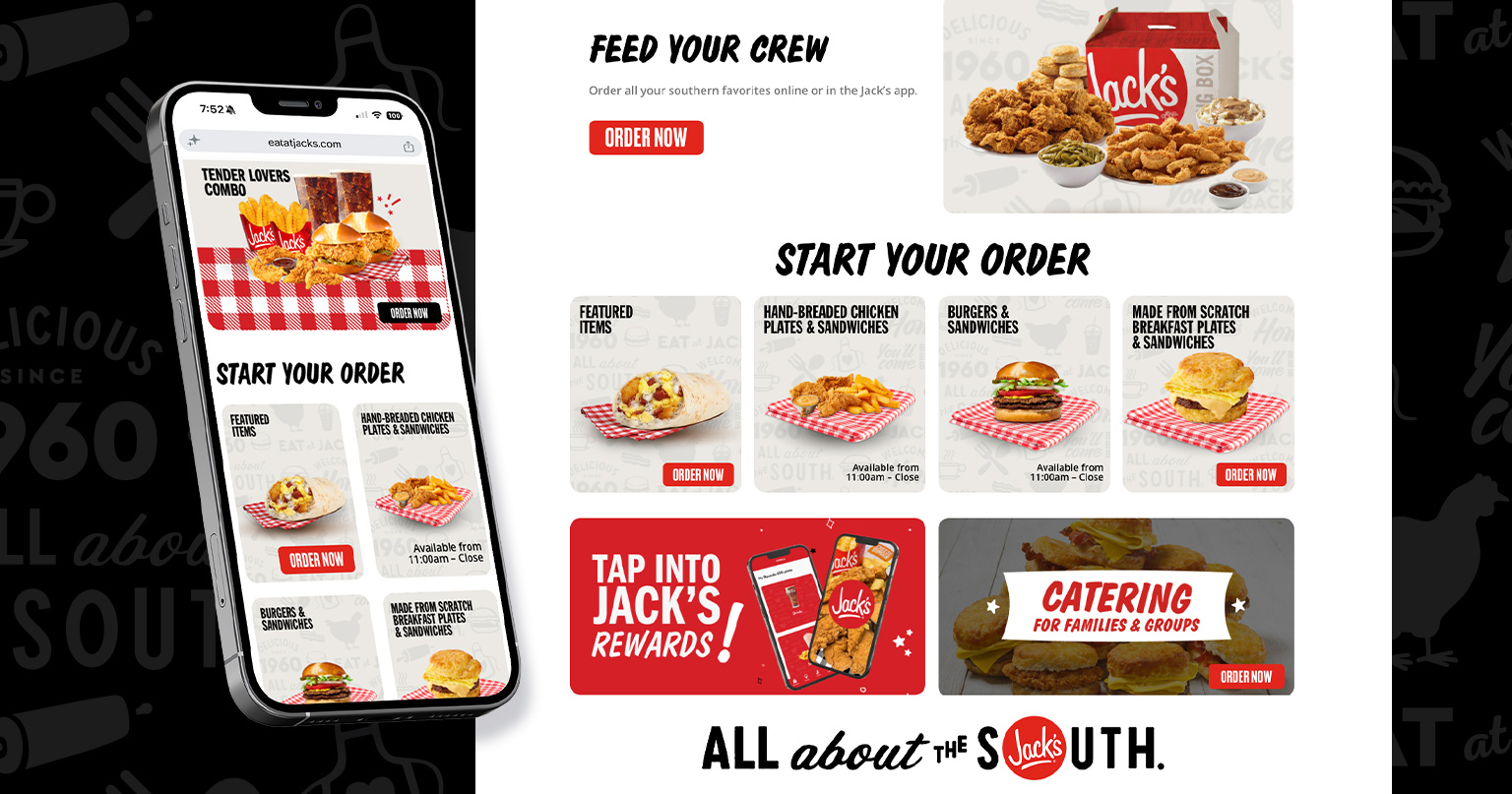
The homepage was designed to accelerate customer conversion.
Near full width cards create intuitive story lanes for time of day offers, quick pick categories, menu access, rewards, and catering, giving hurried guests a fast path to the content most likely to drive action. Repeated CTAs across these modules provide multiple conversion entry points, helping users order quickly without forcing them through unnecessary navigation layers.