Simpler is Better
Short and sweet for this Monday… Let’s get back to the basics.
Most successful websites have 4 key things in common:
- Designed for mobile
- Minimal design
- Fast load time
- Designed for conversion
Designed for Mobile
Today, if your website isn’t designed for mobile, it isn’t designed for up to 77% of all people potentially visiting your website.*
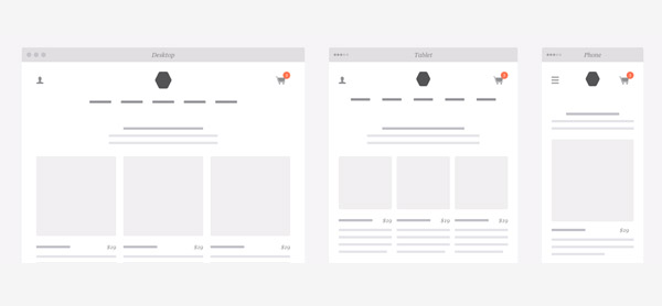
Mobile design is more than just shrinking down the page to be viewable on a mobile device. It involves modifying the overall design of the site, layout and information architecture to meet the needs of the user when they are on their mobile device. Mobile design also takes into account the continued decline in attention people have when visiting a website and to make the most relevant items first and foremost in its website design.
Minimal Design
If you take a look at some of the most beautifully laid out and high-traffic websites on the web you will begin to see some common features when it comes to their design.
Great design is invisible. Well-designed websites tend to have less going on. They tend to have minimal design. What’s interesting when it comes to good design is that there is typically less going on.
“Unpleasant” websites tend to have more images, more fonts and more colors than a professionally designed website which not only slow down load times, but also make the content harder to visually digest for a user.
Fast Load Time
When a visitor goes to a great website they aren’t really thinking about the site itself, they are instead engaged with the content and the overall experience the site is creating for them.
When a website takes a long time to load it instantly takes visitors out of their experience with the content and makes them aware of the site itself.
Today, load time is such an important aspect of user experience that Google factors in website load time as part of its search rankings.
Designed for Conversion
Most successful websites strive to find alignment between meeting the needs of the visitor and meeting the needs of the business. In order for a website to be successful, it needs to do both.
Most successful websites have a clear easy to understand sitemap that is no more than two or three layers deep. The content on the page is easy to scan and allows users to navigate to key content with a minimal number of clicks, which fulfills the need of the visitor. Conversion means getting your visitors to do what you want them to do, whether that is to buy your product, sign up for a newsletter, download a whitepaper, or fill out a contact form.
Websites that fail to convert are muddled and perplexing. They lack clarity and focus and confuse visitors rather than help them.
A website designed for conversion takes visitors down a clear path. It identifies the needs of the visitor and gives them a clear next step for them to take.
Wrapping It Up
There you have it, the four things that most successful websites have in common. This number could definitely be expanded but these are the major items. None of these are secrets, but when it comes to great website design, remember, simpler is always better.
*https://developers.google.com/webmasters/mobile-sites/


